
Overview
01
Streamlining civic engagement
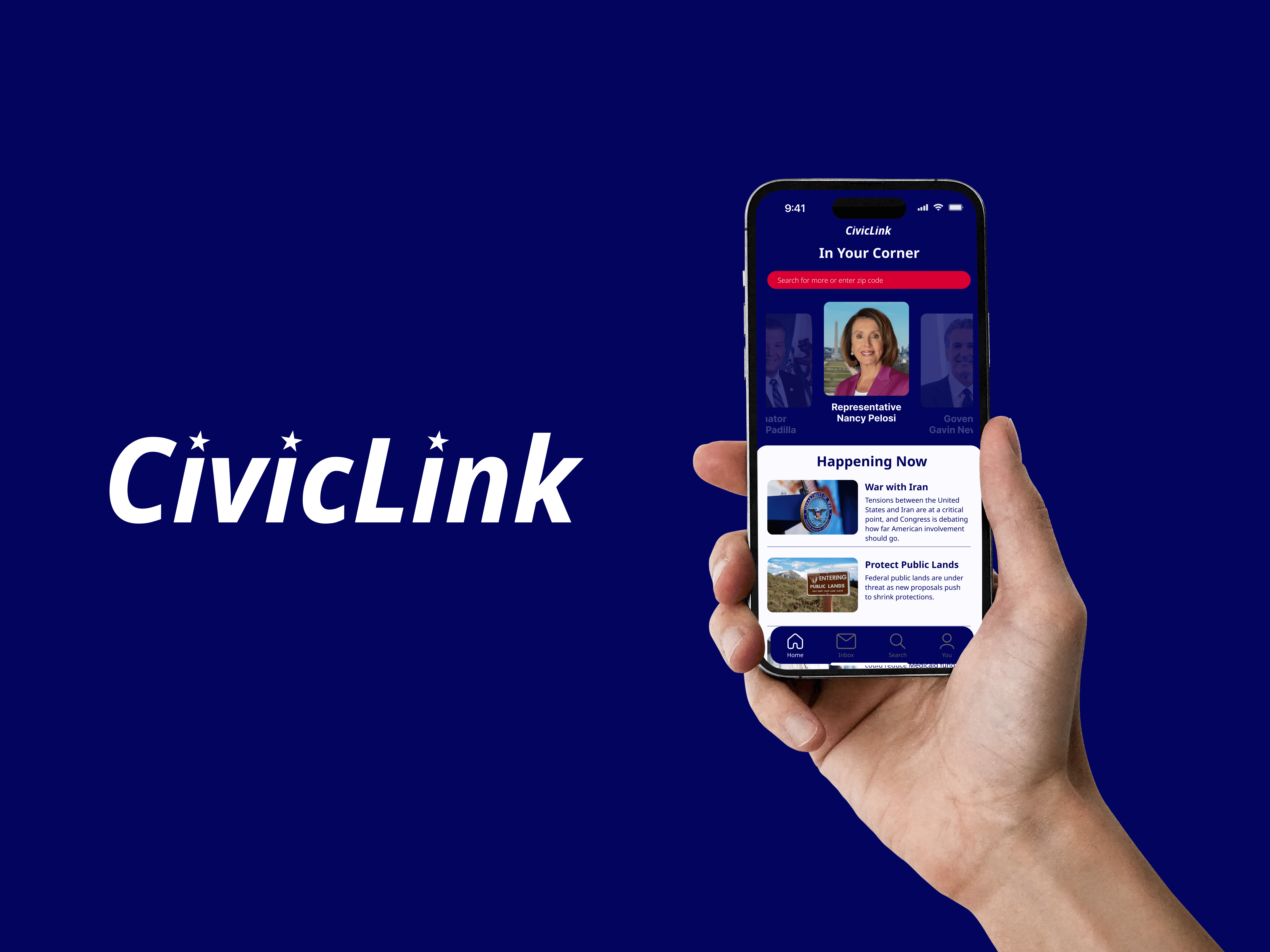
CivicLink is a mobile app designed to make civic engagement simple and accessible. While tools for finding representatives and contacting them do exist, they're scattered. Users are often bounced between government websites, search results, and third-party platforms to accomplish what should be a straightforward task. CivicLink brings it all into one place: find your federal and state representatives, learn enough about them to feel informed, and reach out without ever leaving the app. The goal is to lower the barrier to participation so that more people, regardless of political experience, feel empowered to make their voice heard.
My Role
UX/UI Designer & Researcher
Responsibilities
user research, user testing, competitive audit, prototype, design system
Duration
4 weeks
Understanding the User
02
User Research
To better understand the problem space, a survey was conducted to explore the challenges people face when trying to find and contact their local and federal representatives. The research aimed to uncover what information people are actually looking for, where they currently go to find it, and what friction they encounter along the way. Participants were asked about their past experiences contacting a government representative, their confidence in the accuracy of information they find online, and what information they seek about their representative. The goal was to ground the design decisions in real user behavior and needs rather than assumption.
Pain Points
1
Trust
2
Information overload
3
Confidence to act
Personas
Problem Statement
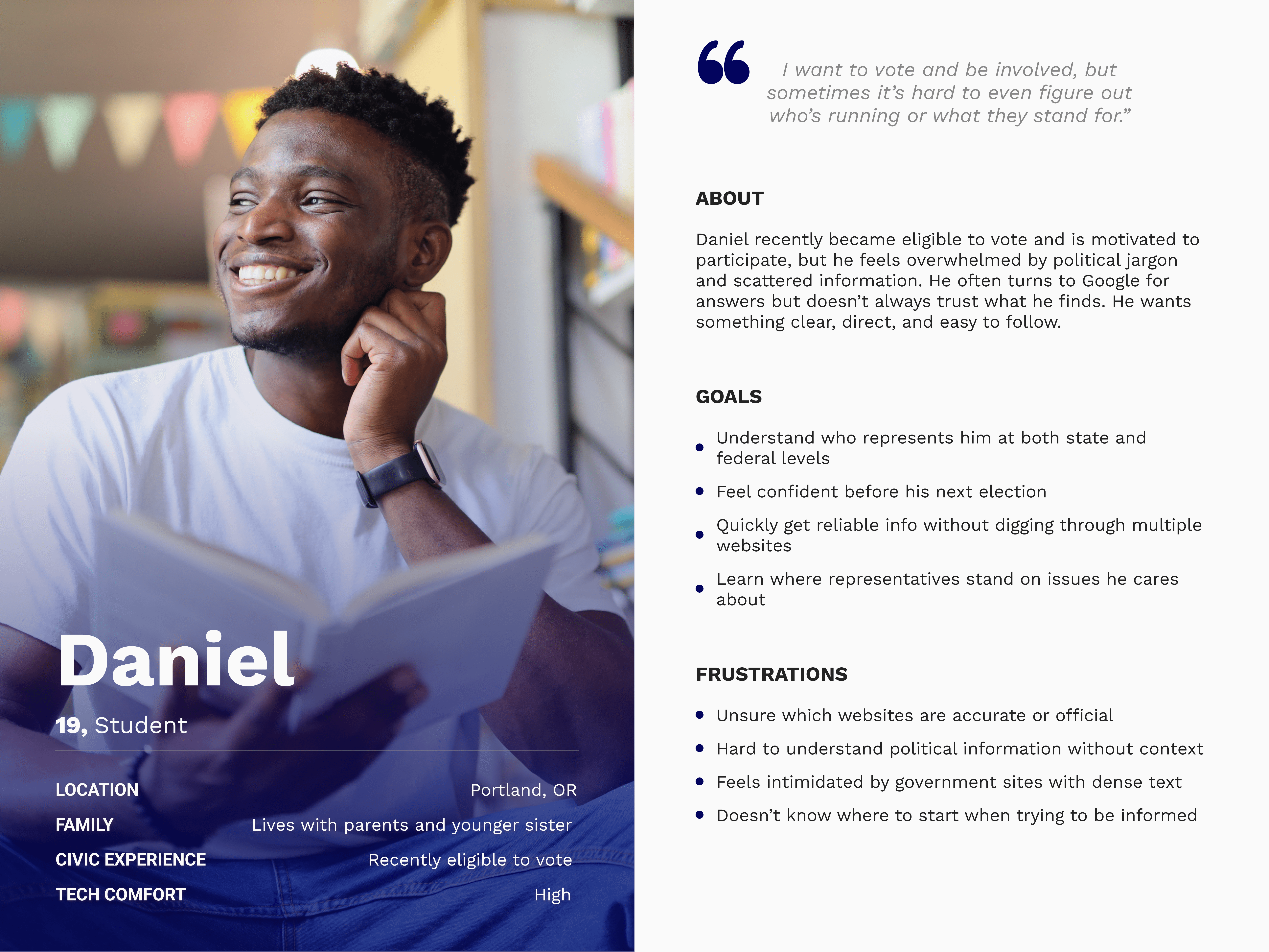
Daniel is a first-time voter, who needs a simple trustworthy way to learn about his government representatives because he wants to feel informed and confident when participating in the next election.
Problem Statement
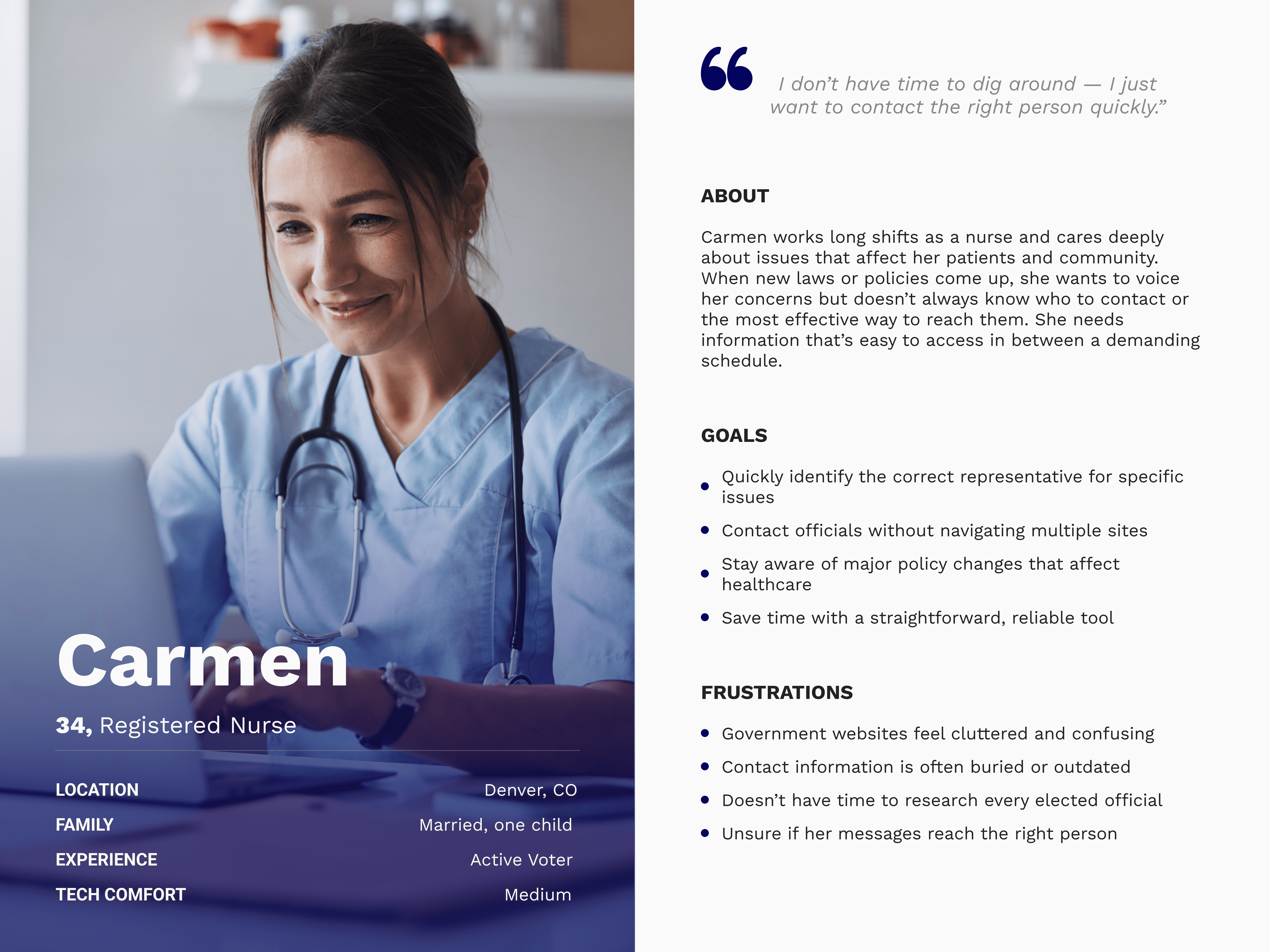
Carmen is a busy healthcare professional who needs quick, reliable access to her representatives' information because she wants to take actions on issues that matter to her without wasting time.
User Journey
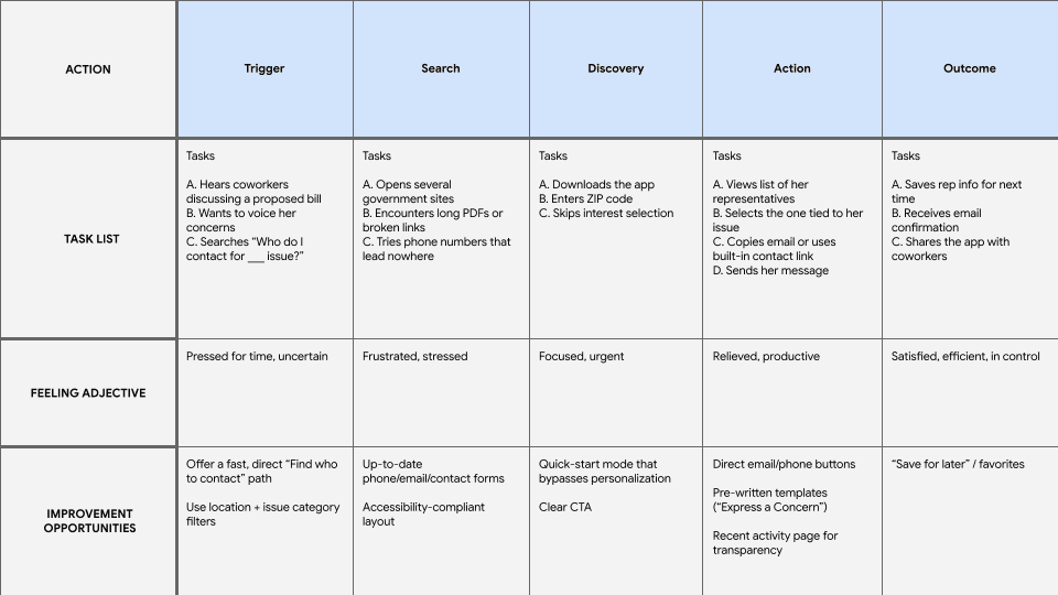
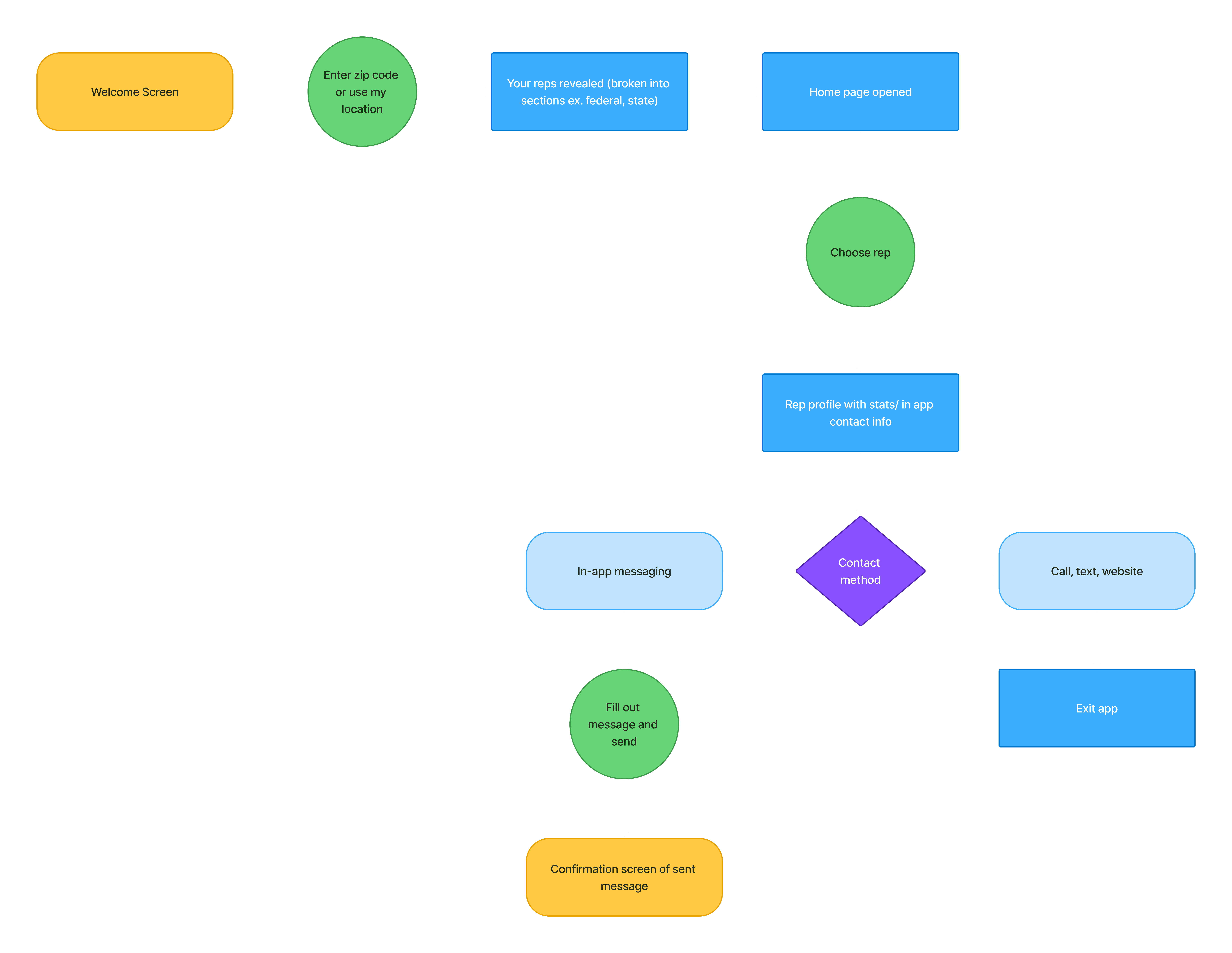
User Flow
Starting the Design
03
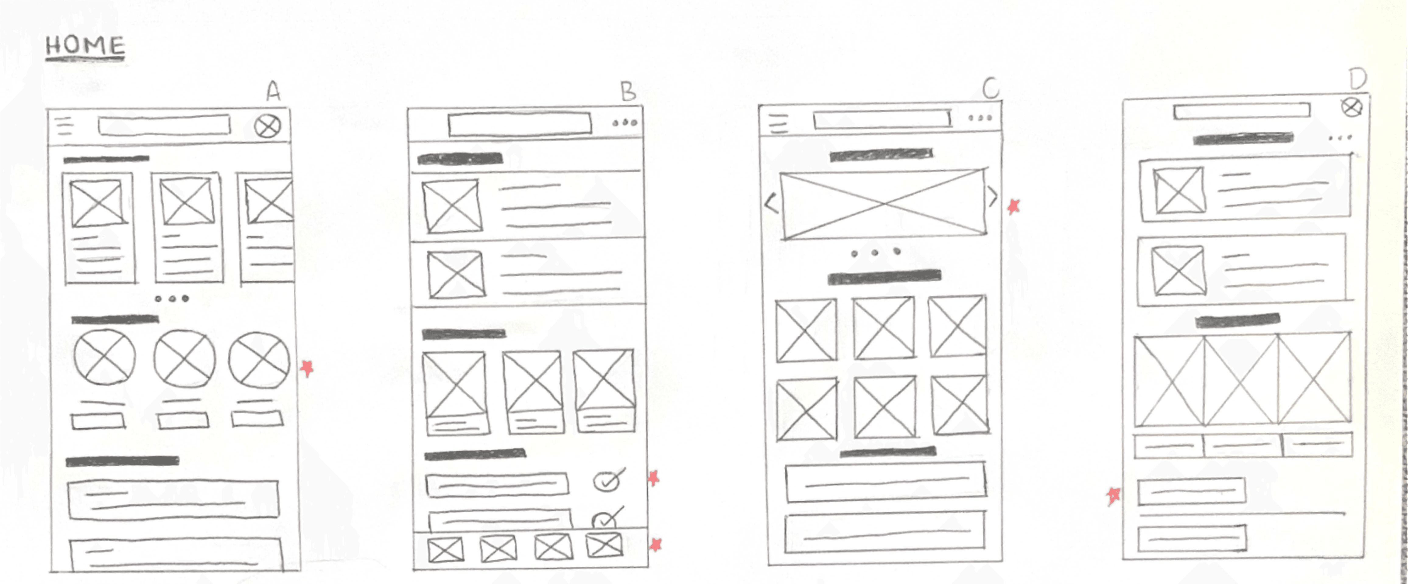
Sketching
During early exploration of the home screen, two core elements came into focus. The first was quick access to your representatives, ensuring the app's primary function was immediately visible and easy to reach. The second was a current issues feed, surfacing relevant news and policy stories to give users a reason to engage and a starting point for reaching out.
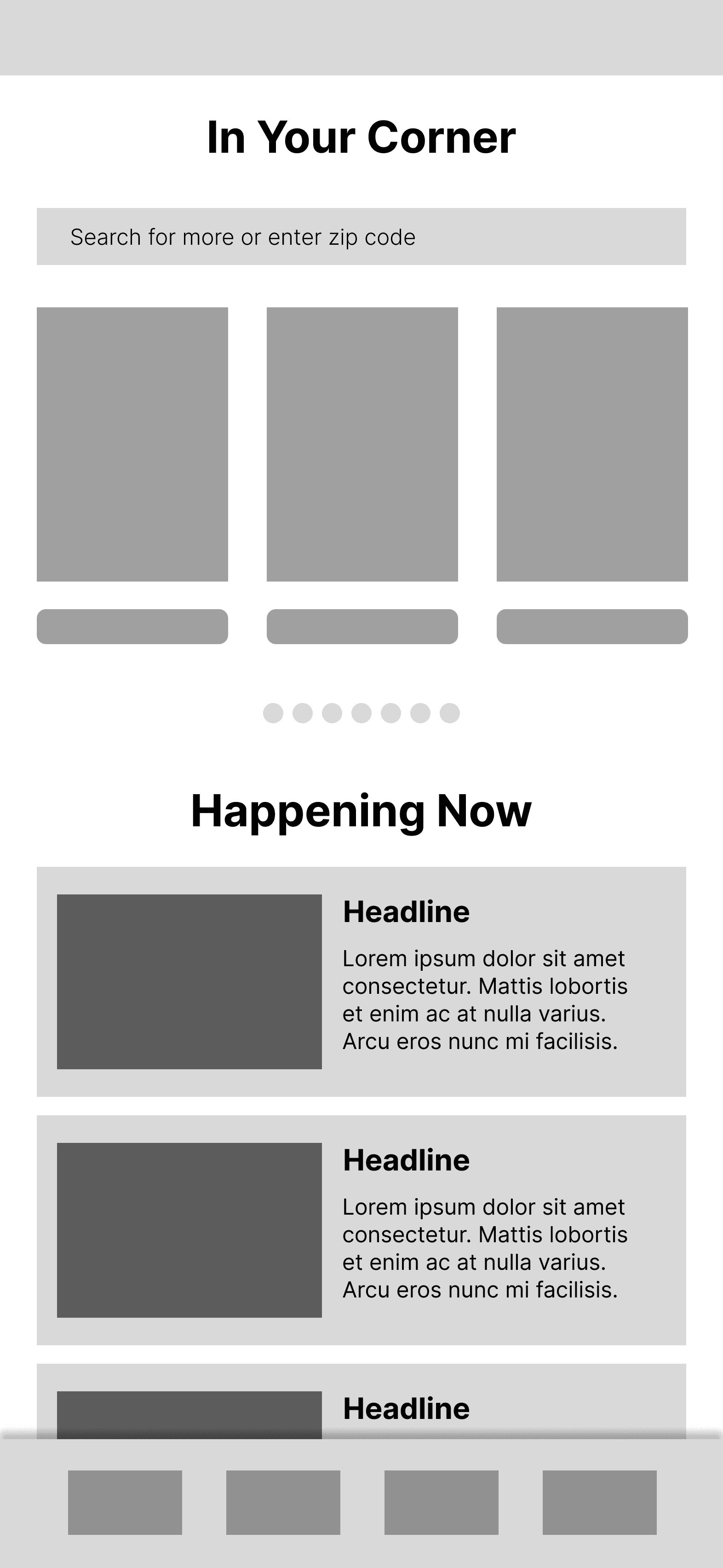
Wireframes
The digital wireframe for the home screen consolidated the layout into a focused top section displaying the user's representatives alongside a clear entry point into current issues.
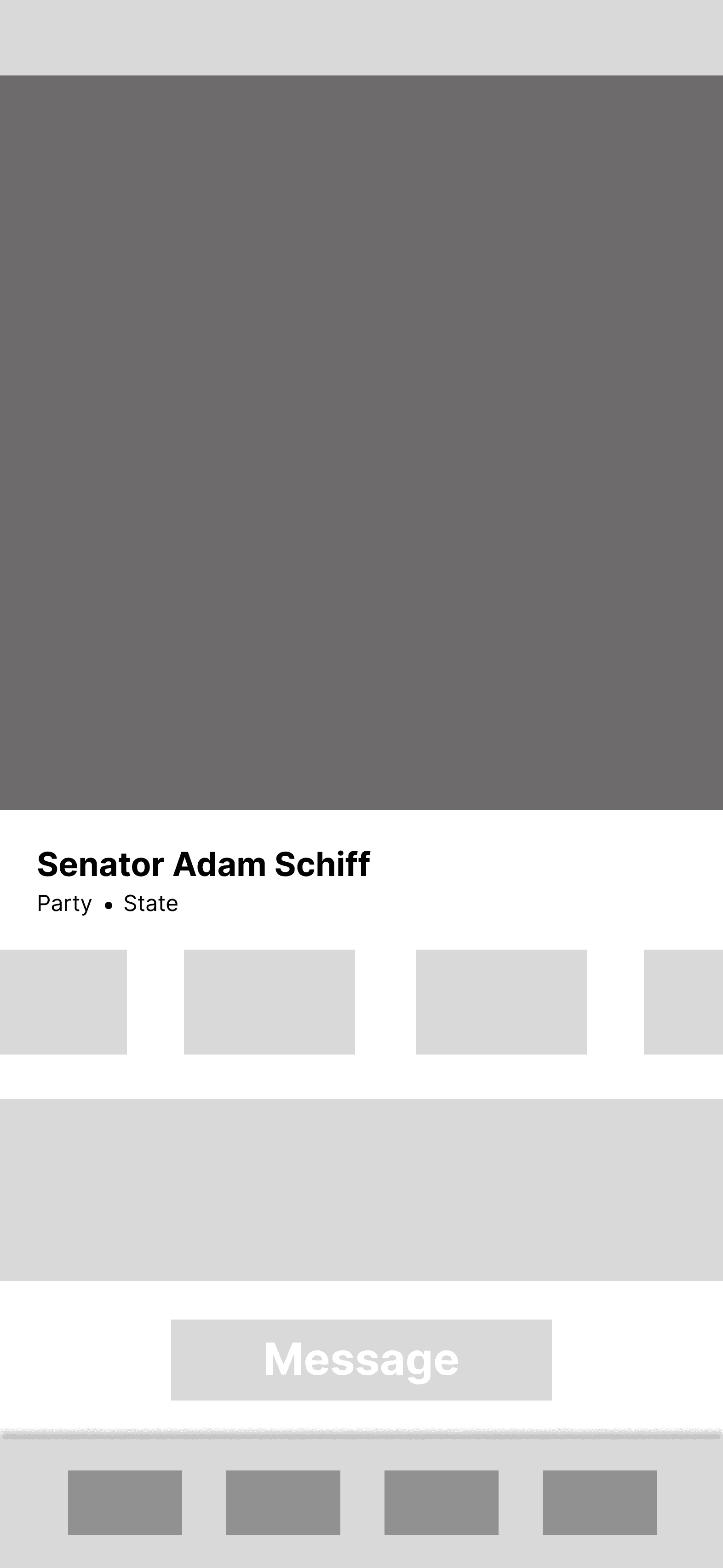
The representative profile wireframe established a simple structure leading with key demographic information and a prominent call to action to contact the representative directly.
Low-Fidelity Prototype
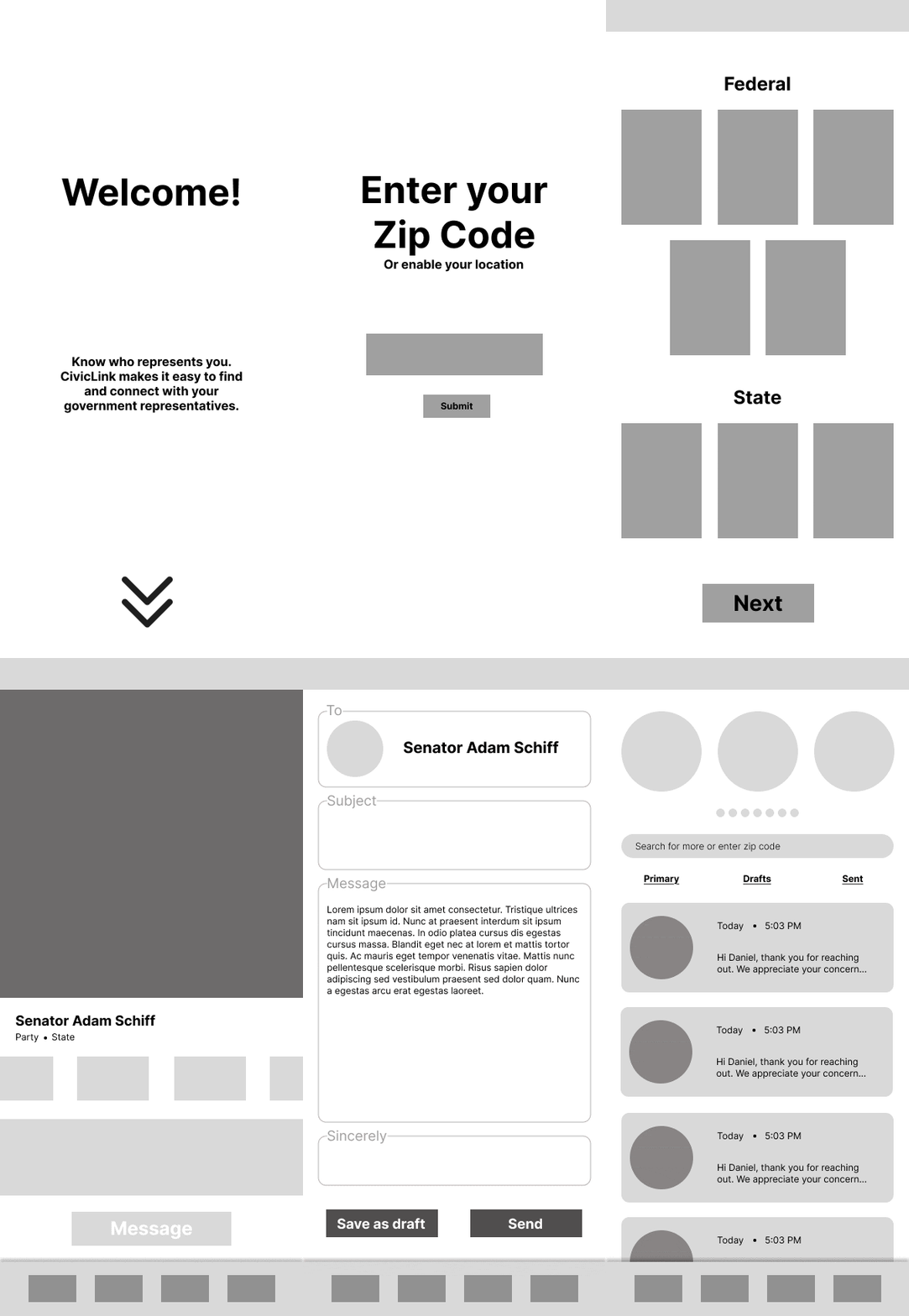
The low fidelity prototype mapped the core user flow from onboarding through zip code entry, surfacing their representatives on the home screen, exploring a representative's profile, and completing the primary goal of composing and sending a message.
Usability Studies
Two rounds of usability testing were conducted in an unmoderated setting, revealing three key areas for improvement.
1
CTA visibility
The message your representative button was easy to overlook, causing users to struggle completing the app's core action.
2
Zip code flexibility
Users wanted the ability to look up representatives for a different zip code, not just their own.
3
Confirmation feedback
After sending a message, users had no indication that it was successfully delivered, leaving them uncertain about whether their action had any effect.
Refining the Design
04
Mockups
High-Fidelity Prototype
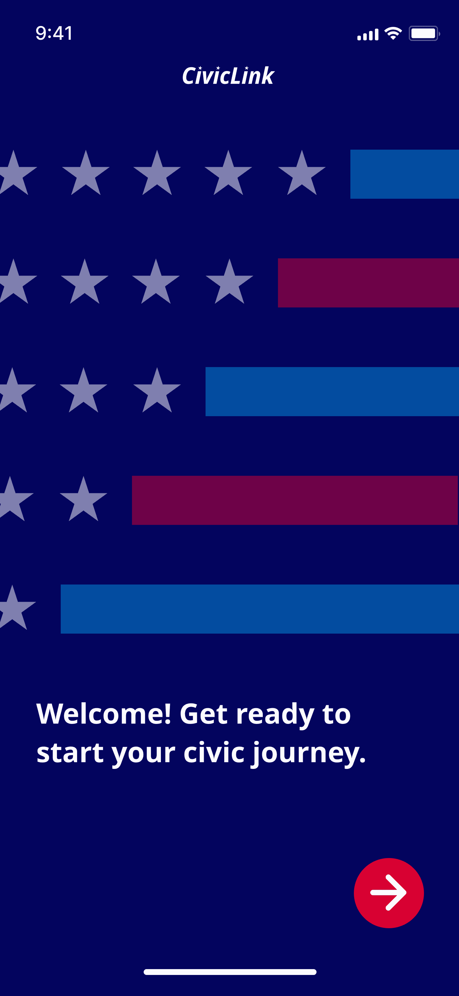
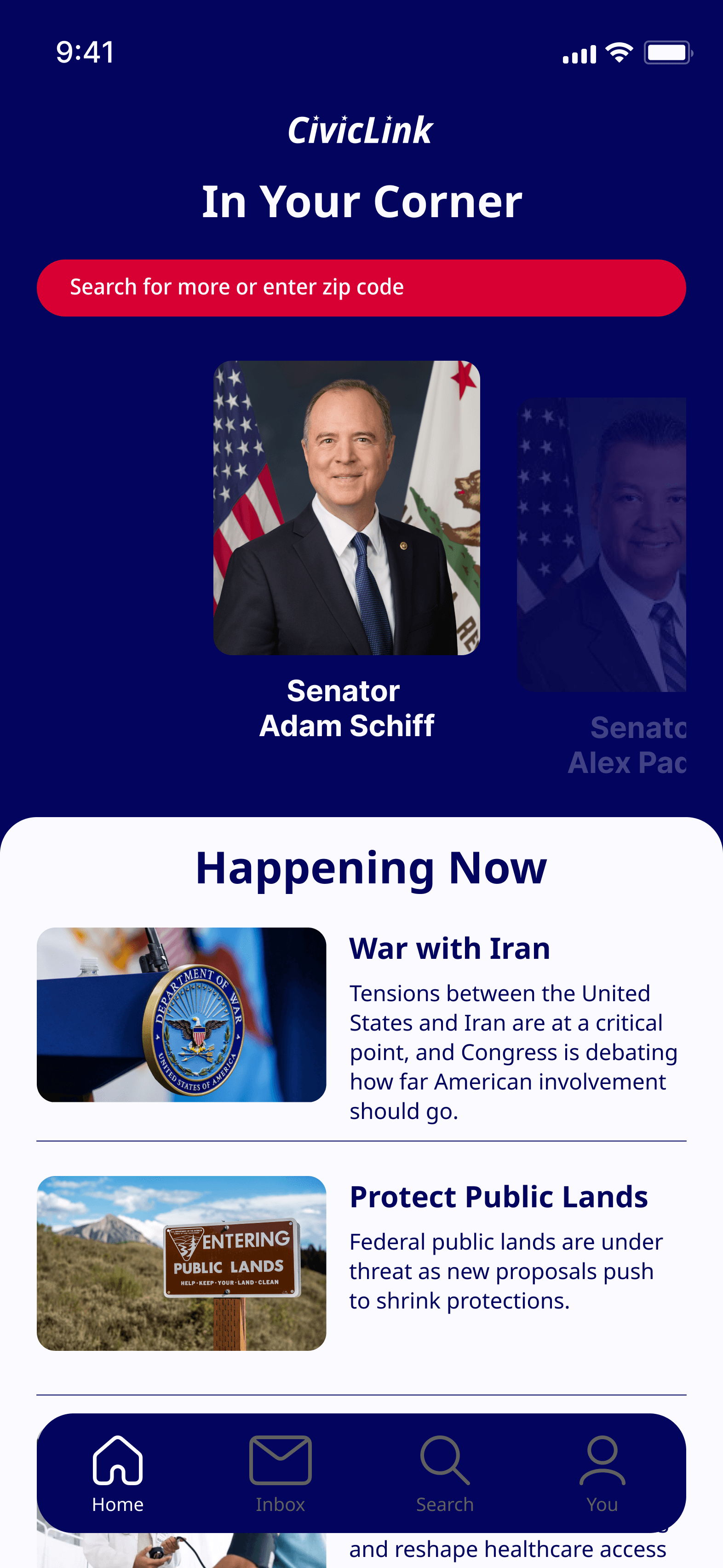
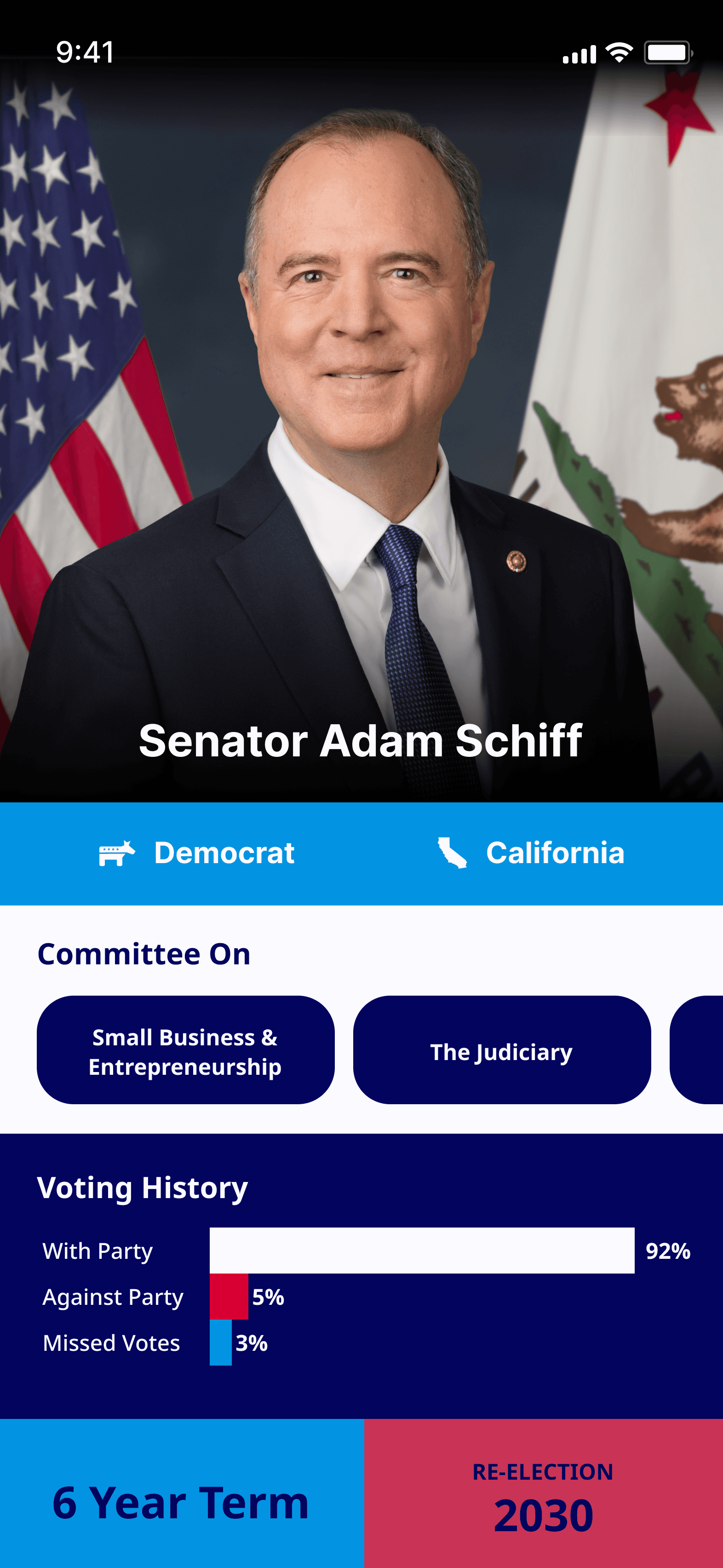
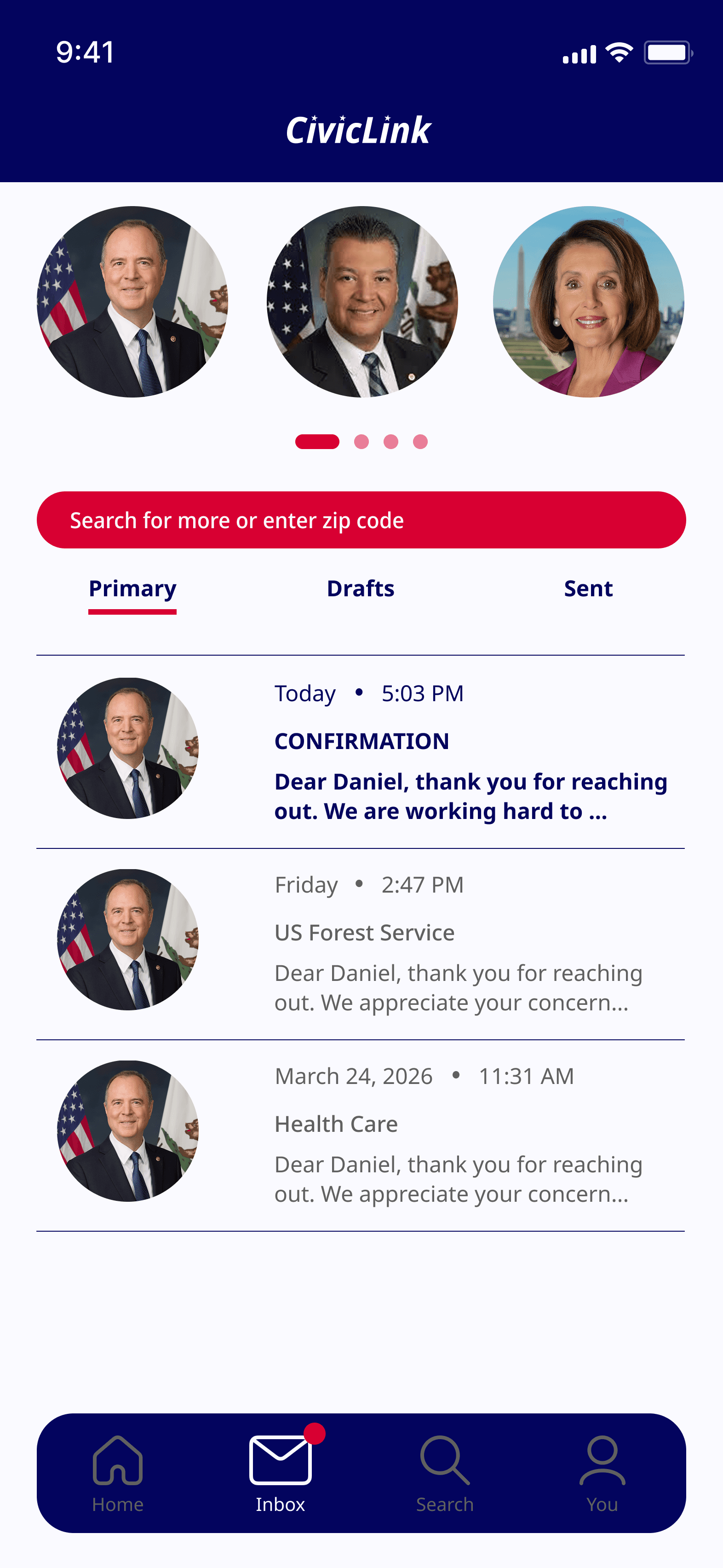
Following the usability study, the high fidelity mockups were updated to address the three key findings.
The representative profile screen was redesigned to give the message CTA greater visual prominence and a more intuitive flow. A search page was introduced to allow users to freely explore representatives beyond their own zip code. Finally, a confirmation screen was added to close the loop after sending a message, giving users clear feedback that their action was completed.
Prototype
Accessibilty Considerations
1
Visual
Color contrast across the app was tested against WebAIM standards to ensure readability for users with visual impairments. Text sizing is legible on mobile screens and labels are used alongside visual elements to avoid relying on color alone to convey meaning.
2
Interaction
Touch targets were sized to meet minimum tappable area guidelines, making the app comfortable to navigate for users with motor differences. Button labels are descriptive and action-oriented so users always know what to expect before they tap.
3
Content
Language throughout the app is kept plain and straightforward, with no assumed knowledge of civic processes or political terminology. Confirmation feedback after sending a message ensures all users receive a clear signal that their action was completed successfully.
Going Forward
05
Takeaways
Impact
Usability testing revealed that design iterations had a meaningful impact on user confidence and satisfaction. After incorporating the confirmation screen, one participant noted: "After sending the message, seeing the confirmation was so encouraging." This validated the decision to close the loop at the final step of the flow, reinforcing that small feedback moments can have a significant effect on how empowered users feel to engage civically.
What I Learned
This project reinforced how essential user research is to the design process. What initially felt like an overwhelming scope became manageable once research began guiding decisions, allowing each step to build purposefully toward a solution that genuinely serves the user. The process was a reminder that good design is not about solving everything at once, but about staying grounded in real user needs and letting that focus lead the way.